Increasing monetary donations for a NYC non-profit’s mission to end food insecurity
A Moderated Remote Usability Test for the Urban Outreach Center

The Research Team
RESPONSIBILITIES
Scope project goals with client, develop moderated testing methodology, facilitate usability tests, collate and analyze findings, develop report, present to client
The Challenge
Improve the ability of the website to inspire and facilitate monetary donations
As a community-based non-profit, the Urban Outreach Center relies on help from its donors and volunteers. At the beginning of this study we got to sit down with the organization and learn about this process. Together we identified monetary donations as the biggest area for community engagement improvement.
The Target Demographic
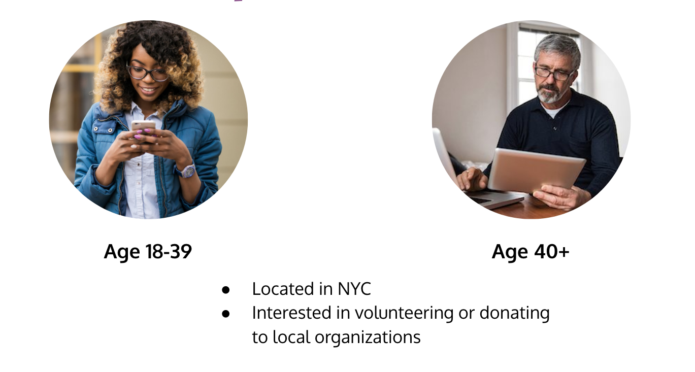
Increase donations from existing 40+ donors while encouraging a younger demographic to get involved
The bulk of current monetary contributions are received from donors over the age of 40. Together with the Urban Outreach Center, we decided to split the target demographic and test for usability issues that could be dissuading both prospective younger donors and existing older donors.

10 Participants
60% aged 18-39 - mobile
40% aged 40+ - desktop
Remote Moderated Tests
Using a platform called UserZoomGO, moderators were able to see a user’s screen as they navigated through a series of tasks designed to test the website’s ability to persuade a prospective donor and facilitate the online payment. The tasks progressed from general to granular, first testing for the user’s understanding of the organization’s mission, then assessing the website’s ability to convey the positive impact a donation, and then testing the donation infrastructure itself. The user was asked to think aloud as they attempted each task, helping the moderator to identify moments of confusion and joy during the website navigation.
Post-test analysis
After conducting sessions with all 10 participants, the research team aggregated the feedback from all tests and created a list of the unique usability issues. The usability challenges were ranked using the Nielsen Severity Scale, both in context to how they affected the overall website experience and in context to how they might impede the center’s monetary goals. The challenges with the highest severity scores were prioritized for resolution, giving preference to those that posed a challenge specifically to donations.

Our Findings
Users were overall impressed by the aesthetics and messaging of the website, but sometimes got lost in button redundancy, long pages, and the organization of the navigational menu.
We believe that by addressing these issues, the Urban Outreach Center can elevate their existing messaging and increase financial contributions.
The Positives
Users overall found it easy to make payments…
…ranked the website favorably compared to other donation platforms…
…and appreciated the aesthetics of the website.
"Like the colors, aesthetically pleasing and clearly see where [Urban outreach] is putting their services" — User
The Usability Recommendations
Usability Challenge #1 - Redundancy
The Current Website
Some users were confused by the redundant donation buttons on the Give Monthly page.
The Recommendation
Highlighting the impact of the donations before the call to action and consolidating the donation buttons could help ease this confusion.
Usability Challenge #2 - Endless Scrolling
The Current Website
Users, especially on mobile devices, commented that it was easy to get lost in the long pages. They found the graphics and text contained impressive and convincing information, but sometimes missed relevant info in the scrolling.
The Recommendation
Adding in a pop-up menu that hyperlinks to different sections of long pages could help users navigate and find important information.
Usability Challenge #3 - Menu Wording and Organization
The Current Website
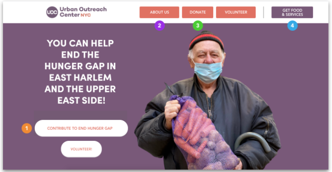
Some users were confused by the labeling of the buttons, not realizing ‘Learn’ contained information about the organization’s mission and thinking that ‘Give meals to hungry neighbors!’ was a volunteer (not donation) opportunity. They were also confused why the buttons relevant to those trying to get services weren’t separate from those trying to volunteer and donate.
Our Recommendation
By consolidating the donation buttons, rewording based on user feedback, and moving the 'Get Food & Services’ to its own category these usability challenges can be resolved. Furthermore, multiple users expressed that the information in the Learn/About Us page was compelling in their decision to donate. By placing this button first in in the menu, it is possible that more users will click on it and be inspired to give.

Wrapping Up
Presenting the findings and report to the Urban Outreach Center.
Thank you for a great collaboration!
Potential for Future Work
It was pleasure working with the Urban Outreach Center on this usability study. While we believe the user feedback collected is a strong starting point for the center to meet its financial goals, it could be advantageous to build on these results with A/B testing, a potential next step discussed in our final session. This type of test could help rigorously compare the efficacy of specific messaging schemes and optimize the website’s text and imagery to inspire donations. We wish the Urban Outreach Center the best as they carry the results of this study forward!


