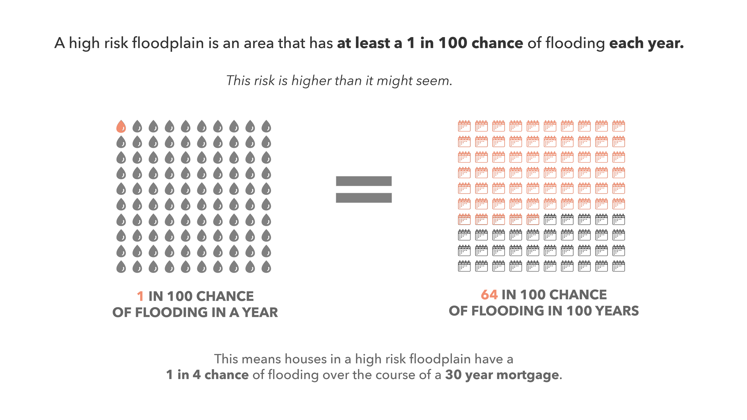
High risk floodplains in New York City are projected by 2050 to overtake the homes of 1.9 million. These residents are not equitably positioned to prepare.
In this infographic, I unpack what this risk looks like and combine geospatial and census data to illustrate who bears the brunt of the projected burden.
Note: This project is best viewed on a desktop screen. The level of detail and report format are not optimized for mobile devices.
Tools Used
Python Pandas and GeoPandas for spatial and non-spatial data analysis
QGIS for fixing floodplain geometries
Adobe Illustrator for infographic layout and icon creation
Procreate for hand-drawn illustration


