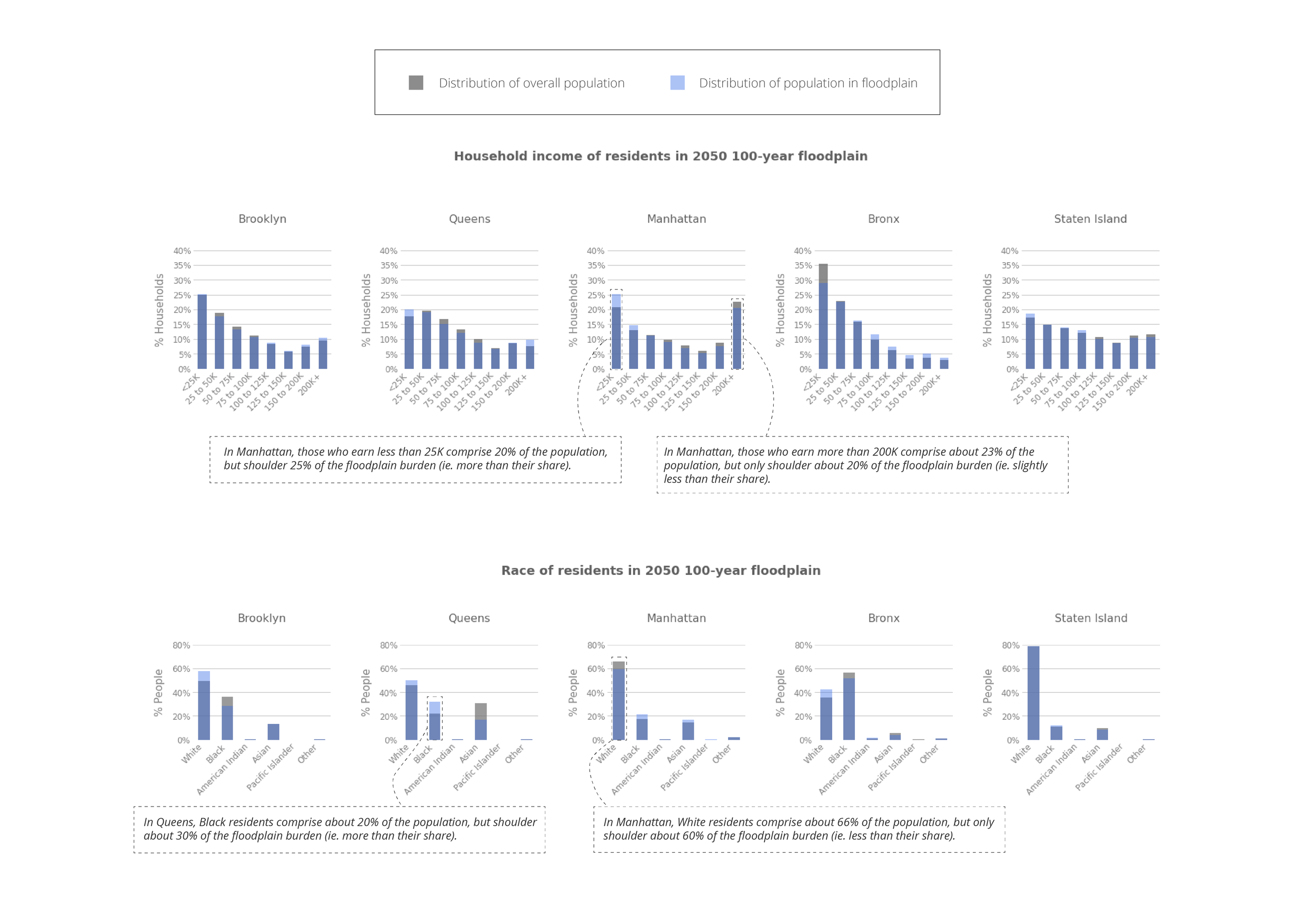
Rising tides in NYC imperil public housing and dense, low-income neighborhoods. Many of the residents in these neighborhoods are Black.
This project is an extension of my previous flood projection work. In the following map narrative, I visualize the demographics of those living in high risk floodplains and highlight neighborhoods that are likely to be particularly hard hit.
Note: This project is best viewed on a desktop screen. The level of detail and report format are not optimized for mobile devices.
Note: This project was completed in partnership with the Spatial Analysis and Visualization Initiative at Pratt Institute. The data analysis and mapmaking is entirely my own.


